Now just a bit of gallimaufry about ceilings…
First the obvious… ceilings, as we know, are the surface above our heads protecting a room from the elements or an upper story. They can be the underside of a floor or the roof to the house.
Sometimes ceilings are used to hide upper floors or roof construction.
From the time ceilings became part of our lives, we have been decorating them. Either with simple painting or by emphasizing the structure of the roof or floor overhead. Sometimes the whole ceiling has been treated as if it was a canvas for a painting or a relief.
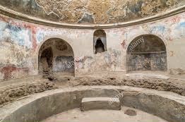
To the ancient Greeks their ceilings were not considered important, so little is recorded about them. But the Romans, as they adapted much from the Greek architecture they all added ceilings rich with reliefs and paintings. An excellent example of the Romans’ love of the ornate are the soffits of Pompeian baths.
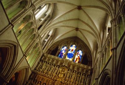
Now during the Gothic period, ceilings developed into decorative structural elements… which, today we refer to as the “beamed ceiling.” During this period they used large cross-girders to support the smaller floor beams which ran at right angles. To make them decorative they symmetrically sloped and molded the edges of those beams and girders. Then, to emphasize them they painted them in bright colors.
Once the Renaissance period evolved ceiling designs reached a fever pitch… Competition seemed rampant
Who could make the most original ceiling?
Which ceiling contained the greatest innovations and differences?
During this period three different types of ceiling became popular.
(1) The coffered ceiling! This is a complex design developed by Italian architects during the Renaissance. They went coffer crazy!
They developed circular coffers
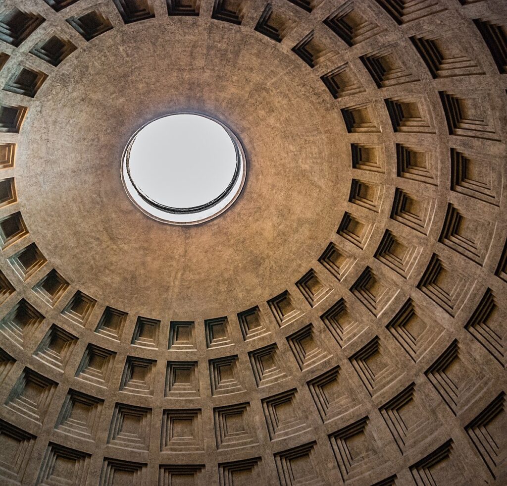
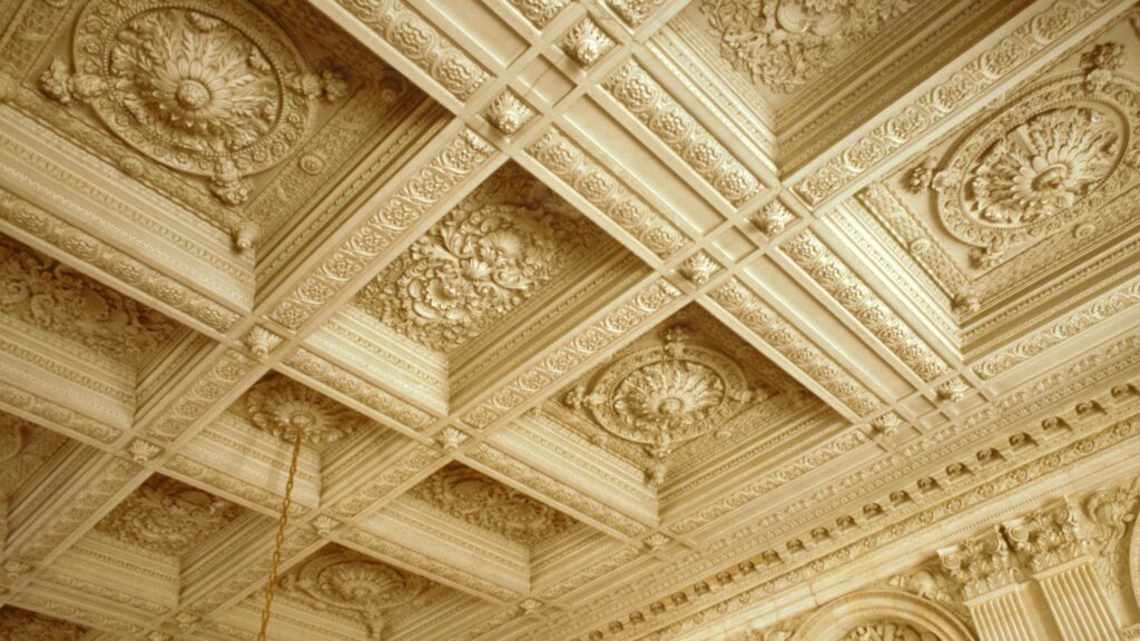
square and L-shaped coffers
and octagonal coffers
They carved the edges with lavish designs, and before long they added rosettes to decorate corners and angles.
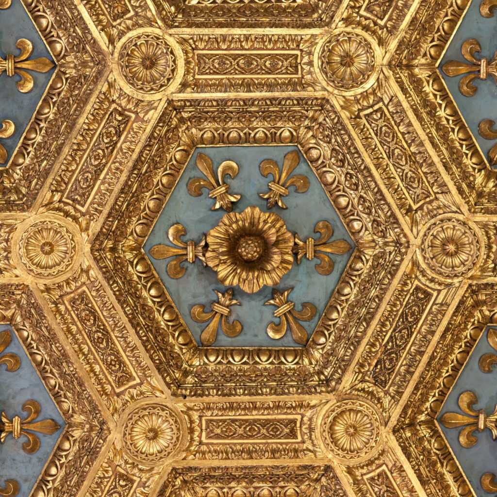
(2) To prove their prowess in the architectural field they took vaulted ceilings to a whole new level. Ceilings became wholly or partially vaulted. They added arched intersections… painted each of those arched intersections to emphasize their intricacy. But there was still bare space so what did they do? Why pictures of course… pictures were added to fill the spaces between the arches.
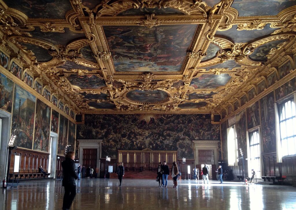
(3) Finally, they decided the whole ceiling must emphasize one large framed picture with ornate carvings surrounding it Doge’s Palace in Venice is a prime example of this type ceiling.
So this is just a bit of the gallimaufry of ceilings. By comparison, the ceilings in our modern homes are quite boring…
Fascinating. I remember the metal ceilings at your Contessa apartment in Honolulu.
We have tin ceilings in our two kitchens and master bedroom at the moment.
Some of the ceilings remind me of intricate patch-work quilting. I didn’t think about that when I actually saw then, but the photographs give a different perspective.
Maybe that is where we got the idea/